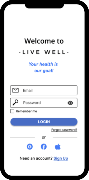
-LIVE WELL-

Project overview
About
Live Well is a health and wellness responsive web app that provides users access to tools to improve their holistic well-being through lifestyle modifications, habit and health tracking (labs and vitals), and educational content. The app is designed for health conscious people that want to live a healthier lifestyle.
Role
UX Designer
Duration
5 months
Tools
Pencil and paper
Figma
Optimalsort
Usabilityhub
Google forms
Design Process
01/Understand
In this stage of the Design Thinking Process, my goal is to understand the problem and empathize with the user.
Competitive Analysis
A competitive analysis was completed on 2 apps currently in the market, AccessElite and NOOM. My goal was to discover both strengths and weaknesses of the apps and come up with features to include and areas to be improved upon.
Problem
Statement
Health and wellness seeking individuals need a lifestyle tracking tool/app to track their progress (diet, exercise, sleep, meditation, etc.), provide motivation, and monitor trends in their vital signs and labs in relation to lifestyle modifications they have applied. We will know this to be true when users get a better understanding of how their lifestyle affects their health, as well as communicate better and efficiently with their providers.
Competitive Analysis
A competitive analysis was completed on 2 apps currently in the market, AccessElite and NOOM. My goal was to discover both strengths and weaknesses of the apps and come up with features to include and areas to be improved upon


02/Observe
During the observe stage of the Design Thinking Process, I performed research on potential users through in-person and online interviews and survey.
User Research
I conducted user surveys and interviews on potential users to gain a better understanding of the problem. As well, identify their goals and needs. The survey was 13 questions long and completed by 21 participants via google forms. The Interview was a total of 12 questions, completed on 4 participants. The findings were then sorted onto stickynotes and grouped in themes and common insights. See below for main insights from each method.
Key Insights
Survey Insights - 21 participants
- Most participants are between 35-44 years old
- Something important to note is that 71.4% of the participants in this group have NEVER been diagnosed with a chronic disease.
- Participants are actively working on lifestyle habits, strongly towards exercise and food related but also note that they still would like to improve their habits. Stress, sleep, and socialization are other areas many people are working on also. One thing I noted is how many people chose stress as a barrier in their lifestyle yet very few people attend therapy (I question if this is due to the stigma around it).
- Lack of time appears to be one of the biggest barriers in people’s lives when it comes to living a healthy lifestyle. Even more reason when an app may beneficial vs going to a facility.
- Nearly half the participants reported using a health and wellness app at some point.
- Looking into participants goals, 20 of the 21 answered. Common goals were to lose weight, gain muscle, eat healthier, maintain health, less stress, and improve some person issues (foot, liver). These are goals related to health habits and reassuring that we are working towards a meaningful problem.
- According to the results: progress tracker, accountability partner, meal/exercise plans, a way to log/track information, and challenges were some of the more popular features participants find helpful and motivating in reaching goals.
Interview Insights - 4 participants
- Potential users are currently trying to work on improving their health (physical, mental, holistically) and are also struggling and wanting help with motivation, habit formation, and education.
- Potential users share a common view of what 'healthy lifestyle' means along with aligning goals to achieve.
- Want features such as motivation (quotes, tips, reminders), an app that covers lifestyle as a whole, social component, achievements and rewards, accountability, and calendar to track workouts.
- Users lack motivation and wasn't motivation from an app for help them reach their health goals.
03/Point of View
The goal during this stage was to place myself into the shoes of the user. To do this I analyzed the information from the previous stage and sorted it into wants, goals, and needs. I then regrouped the categories and main insights. After doing this a general idea of our user population was identified and user personas were created.
Affinity Mapping
Affinity mapping was used to explore findings, create visual maps of relationships, themes, and insights, allowing us to truly understand our participants.


User Personas
Two user personas were created from the information gathered during the survey and interviews. The user personas were an important part of the design process as they helped to keep the focus on the users wants, needs, and goals, while also striving to achieve the business goals.


04/Ideate
In the Ideate stage, with my user persona as a focus, I reviewed all the observations and collected data to come up with a full range of ideas and possible solutions to the identified problem. User flows and task analysis were created to show how users will use the app. Card sorting was used to help identify how to best organize the apps information in a way the is beneficial for the user.
User Journeys


Task Analysis
Using the user stories from the user journey maps, it was determined which tasks were need for users to complete the goals. From there user flows were created from those tasks to complete the goals and create user flows for each of those tasks.
Task Analysis #1 - Add Activity
Objective: As a busy individual who wants to run a 5K race, I want to track my daily activity so that I can see how much I am improving.
Entry point: Create account/Sign up
Success Criteria: Activity is successfully added to the app.

Task Analysis #2 - Favorite a Recipe
Objective: As an individual who wants to lower his cholesterol through dietary measures, I want to search plant focused/plant based recipes and save them to a favorites list, so that I can have a stored recipe list for future use.
Entry point: Log in
Success Criteria: Recipe is successfully saved as a favorite

Card Sorting
A site map was created and refined through a closed card sort. This help organize the content and app structure to best suit the needs and preferences of the users. I used a tool called OptimalSort to conduct the activity.
Original Site Map

Card Sorting Results

“After analyzing the results from the card sort, it is clear that some modifications need to be made on the original site map so that it matches the users needs.“
- For the category “Habits/Goals” I kept all the items listed like the original and allowed for the item “Track Habits/Goals” to be tracked in the “Track” category also. This was necessary as most participants selected “Track” category for this item. Through 4/6 chose the item to in the “Track” category it may be due to the item having the word track on it. For this reason I kept it in both.
- For the category “Connect” I considered removing the item “Challenge” as participants equally chose for it to fall under both “Connect” and “Track”. After great consideration the decision was made and we included it in both as “Challenges” are a way for people to connect and the challenge needs to be tracked. The item “Support” was not added due to lack of clarification (see below).
- For the category “Profile” no changes were made. I was considering moving “Support” to the category “Connect” due to 4/6 participants placing it there but after clarifying with participants, together we decided it belonged under profile. (Habit/Goal support vs web app support)”
Revised Site Map

05/Prototype
Following the sitemap and user flows, paper wireframes and low-fidelity prototypes were created and iterated on. Starting with paper sketches and testing the design in this low fidelity format is important as it allows me to catch any errors or flaws in the design and make necessary corrections prior to reaching a high fidelity prototype.
Wireframes
Low-Fidelity Wireframes


Mid-Fidelity Wireframes


06/Test
In this stage, the interactive prototype was tested with potential users. A test script and test plan was created to facilitate the user testing. The users were observed while interacting with the prototype. I made notes and collected feedback, which was later reviewed and used to improve and iterate the prototype. After testing, the findings were organized through affinity mapping and the rainbow spreadsheet. Improvements were made to key usability issues.
Usability Testing
Summary
The purpose of the study was to gain insight on how users interact with the LiveWell prototype while working through 3 preset tasks (search and favorite and recipe, add a lab value, and add an activity). While participants worked through the tasks, I noted any friction and errors they experienced with the prototype. The usability testing was completed with 6 participants, both moderated in-person and virtual testing methods were used. The sessions were recorded using Quicktime after receiving participant approval.
Affinity Mapping


Rainbow Spreadsheet

Usability Test Changes
Issue 1: When on the add lab values page, and users are trying to add a lab value, they are first selecting the “cholesterol” value (a previous entered value) not the “+” icon.
Severity: High
Suggested Change: Add labels “add lab” and “recent labs.” This required a redesign of the page for balance and to decrease the confusion for vital signs later on.
Evidence: This was observed on all 6 of the participants and they voiced their concerns with the confusion on this page.

Issue 2: When on the add activity page, users moved their cursor around a bit before selecting the “+” icon to add an activity.
Severity: Medium
Suggested Change: Add an “add activity” button. Remove the “+”.
Evidence: This was observed on two participants, another was trying to select the calendar

Issue 3: Users suggested renaming the “nutrition” icon to “recipes”, found to be confusing when searching for a recipe.
Severity: Medium
Suggested Change: Rename the nutrition icon to recipes
Evidence: 3 users suggested the name change.

Issue 4: Users found the homescreen busy but enjoyed the content
Severity: High
Suggested Change: Redesign the homescreen, balance the content and design so it is not overwhelming for the user.
Evidence: 5 out of 6 participants voiced that the homescreen was but but that they liked seeing the content. I therefore removed the suggested content section.

Issue 5: User suggested adding “welcome (name)” to the homescreen
Severity: Low
Suggested Change: Add Welcome (name) to the homescreen.(after redesign of homescreen there was space to add “welcome (name)”
Evidence: Suggested by user for personalization

Refine
To begin this stage, I started with preference testing using the tool UsabilityHub. Next I applied Gestalt psychology, visual design principles, and improved accessibility using the Web Content Accessibility Guideline. This concluded the first iteration of the app.
Preference Tests


Gestalt’s Principles


Improved Accessibility

Product Handoff


High-Fidelity Prototype


